


1
2
3
4
5
6
7
Mohr Editing
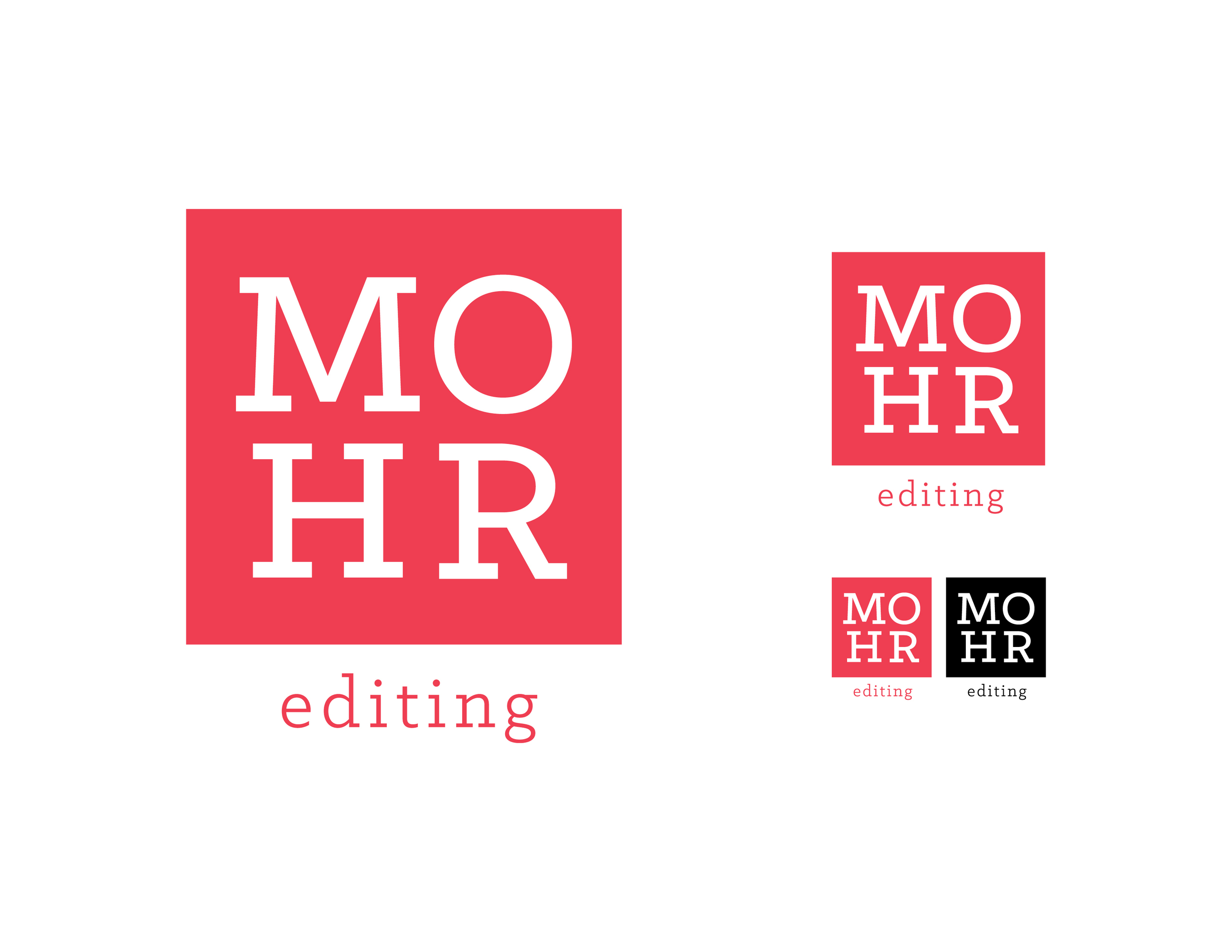
MOHR Block
The MOHR Block is set in the block style suggested by the client keeping a simple and clean design. Displayed at three scales and also in black.
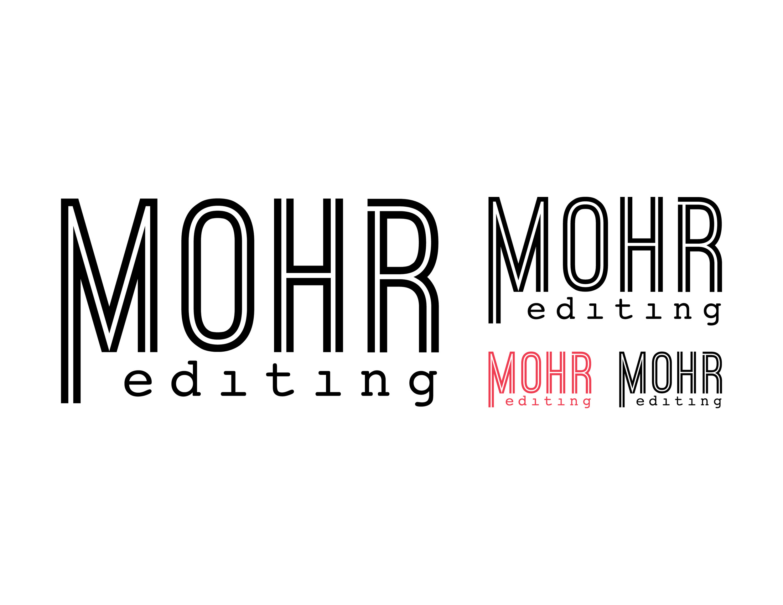
Archer Stet
Archer Stet is set in the typeface Archer. A tongue-in-cheek design using the proof-reader’s stet mark. Displayed at three scales and also in black.
MOHR Ribbon
MOHR Ribbon is more of a “trendy” look but still a strong mark. I would explore an alternate version, so that “editing” isn’t lost when scaled. Displayed at three scales and also in black.
MOHR No. 2
MOHR No. 2 is minimal design, inspired by the No. 2 pencil (editing the old-fashioned way). The bar of color leaves opportunity for branding that will allow the colors to change but the logotype will stay consistent. Displayed at three scales and also in black.
Ostrich
Ostrich is a nod to something modern and retro. The idea is that the client leaves “dotting the i’s” up to you. I imagine color being incorporated on the entire mark, like the smaller version to the left of the smallest black logo. Displayed at three scales and also in black.
Paragraph Block
What the client chose: Paragraph Block stacks the letters, as the client originally suggested using the paragraph mark. There was an alternate type treatment designed for use when scaling (as shown).
the final choice